A place to study how to spend time in life, located at the foot of the Great Wall.
The owner hopes that the building will serve as a medium to showcase an attitude of returning time to life, guiding contemporary people to reflect quietly on the present. Considering the regional climate, while southern architecture is light and outward-looking, northern architecture should be more substantial and restrained. However, exhibition-type buildings are more suited to being presented in an open state. Therefore, how to balance and coexist the introverted nature of the building with the openness of its function is the starting point of the design thinking.
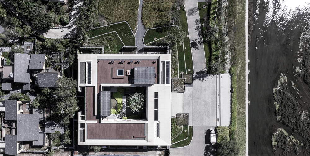
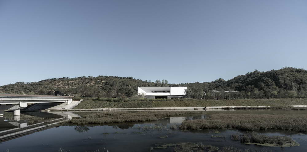
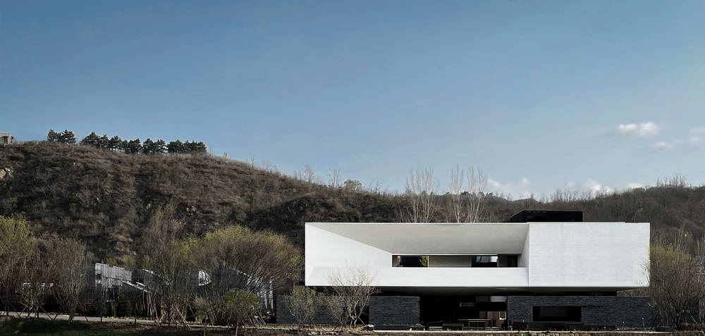
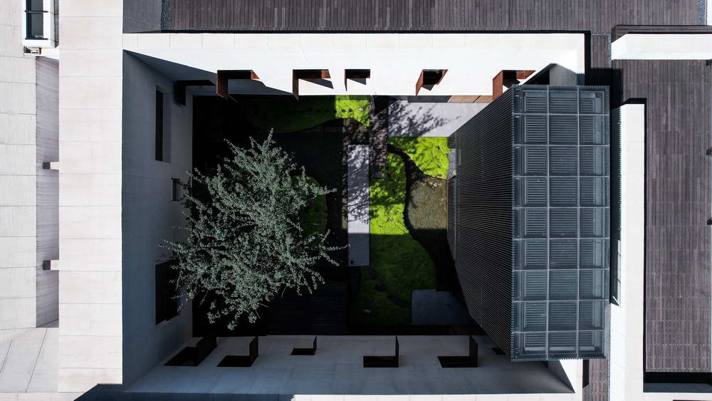
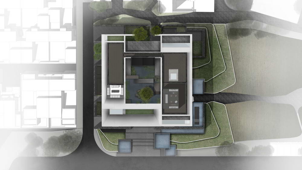
The site is in the shape of an equilateral square, and the architectural form stands in accordance with the base form. We hope that the building can stand out from the environment, and also become the backdrop of mountains, rivers, sky, and villages, pure and clean, low-key and restrained.
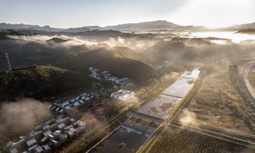
Aerial Map

The site is in the shape of an equilateral square, and the architectural form stands in accordance with the base form. We hope that the building can stand out from the environment, and also become the backdrop of mountains, rivers, sky, and villages, pure and clean, low-key and restrained.
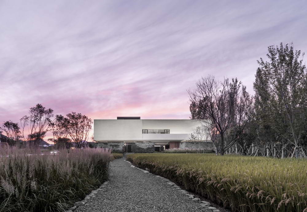
"The White House" stands between the mountains and waters, at the edge of the rice fields, floating above the gardens, unrestricted inside and out.
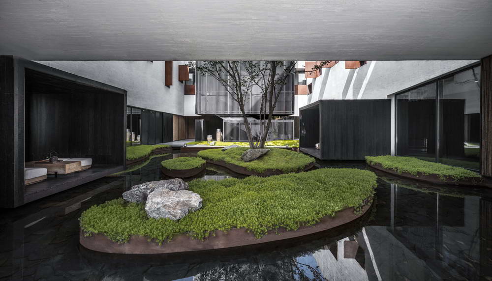
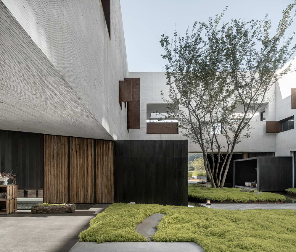
Below lies the courtyard and the yard, with hidden pavilions among the trees, floating pavilions at the water's edge, constructing grass slopes, and placing plank roads, naturally intermittent and winding, gradually leading to the rice fields on the east side;
Bringing in the external scenery and connecting the internal scenery, lush in spring and summer, and vast in autumn and winter, naturally serene; looking up are the mountains, sometimes hidden, sometimes visible, climbing one more floor, one can see a thousand miles away.
Aerial Map

Facade View Across the River

In the homogeneous space, establish attractive points - Montage-like peeking.
The Montage concept runs through the narrative method of the entire architectural space. Creating scenes stimulates people's associations, what you see is part, what you don't see is infinite. In the limited picture, it extends infinite thinking and emotions, giving rise to new imagination, triggering desires for expectation, speculation, and exploration.
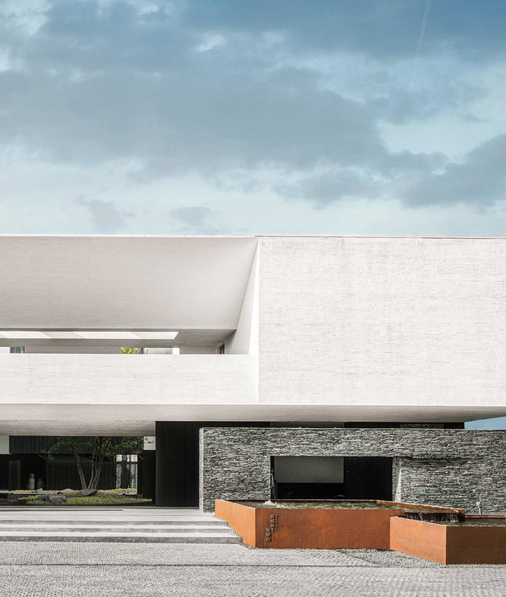
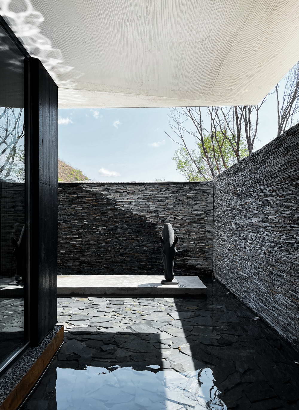
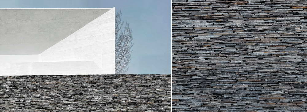
A slabstone landscape wall higher than the eye level surrounds the building, forming a continuous control interface. It seemingly inadvertently but intentionally restrains the display of the interior space, allowing people to peek through the limited openings, becoming the starting point of the desire to explore.
Facade

Facade Detail

The entrance eaves slope inward, expressing a willingness to open outward and achieving the purpose of lowering the entrance's line of sight.
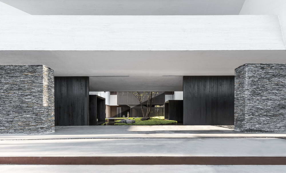
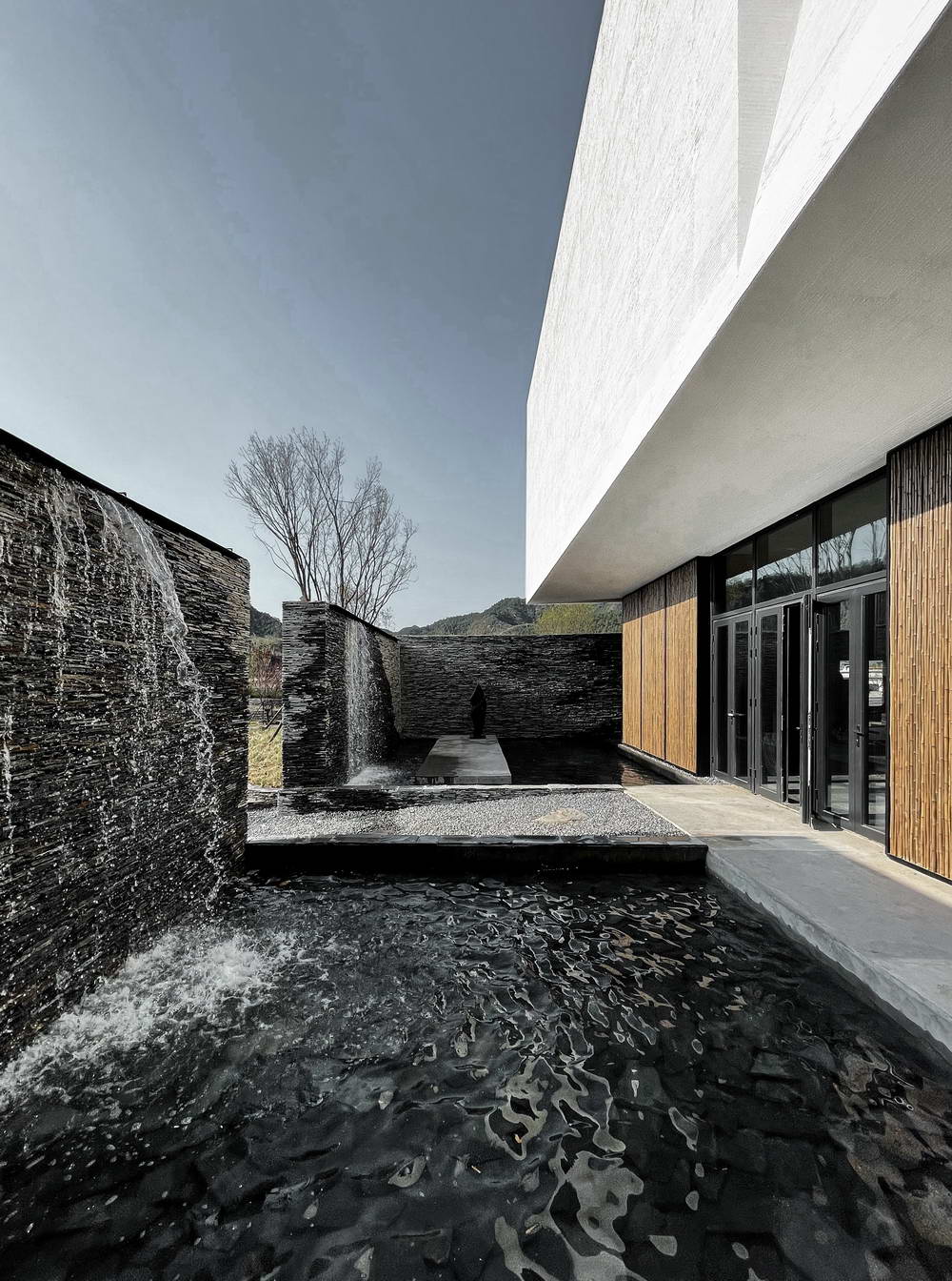
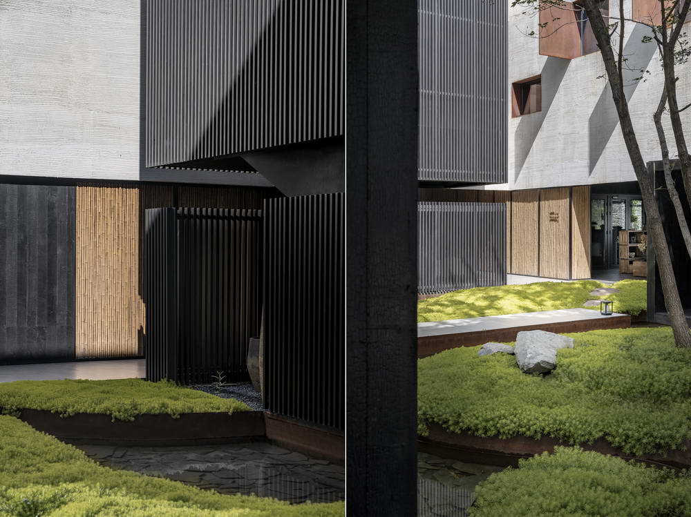
Under the eaves, two large carbonized wood sliding doors serve as the main entrance to the restaurant and reception area when closed, and when open, they become an important element for creating the courtyard.
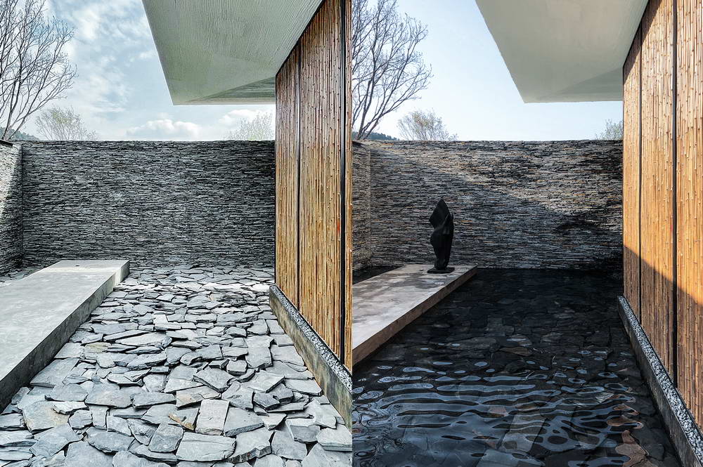
On a clear day, the wooden sliding doors are opened and moved to the side of the courtyard. We consciously cover the inner court and narrow the visible range. Light, water, plants, and wind all emerge from the gaps between the doors, inviting people to step under the eaves and see what's inside.
The Entrance


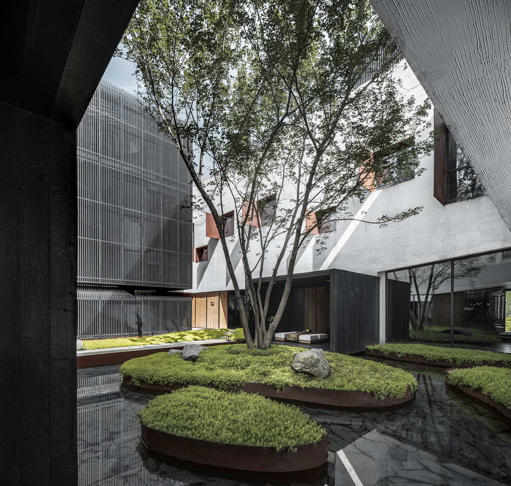
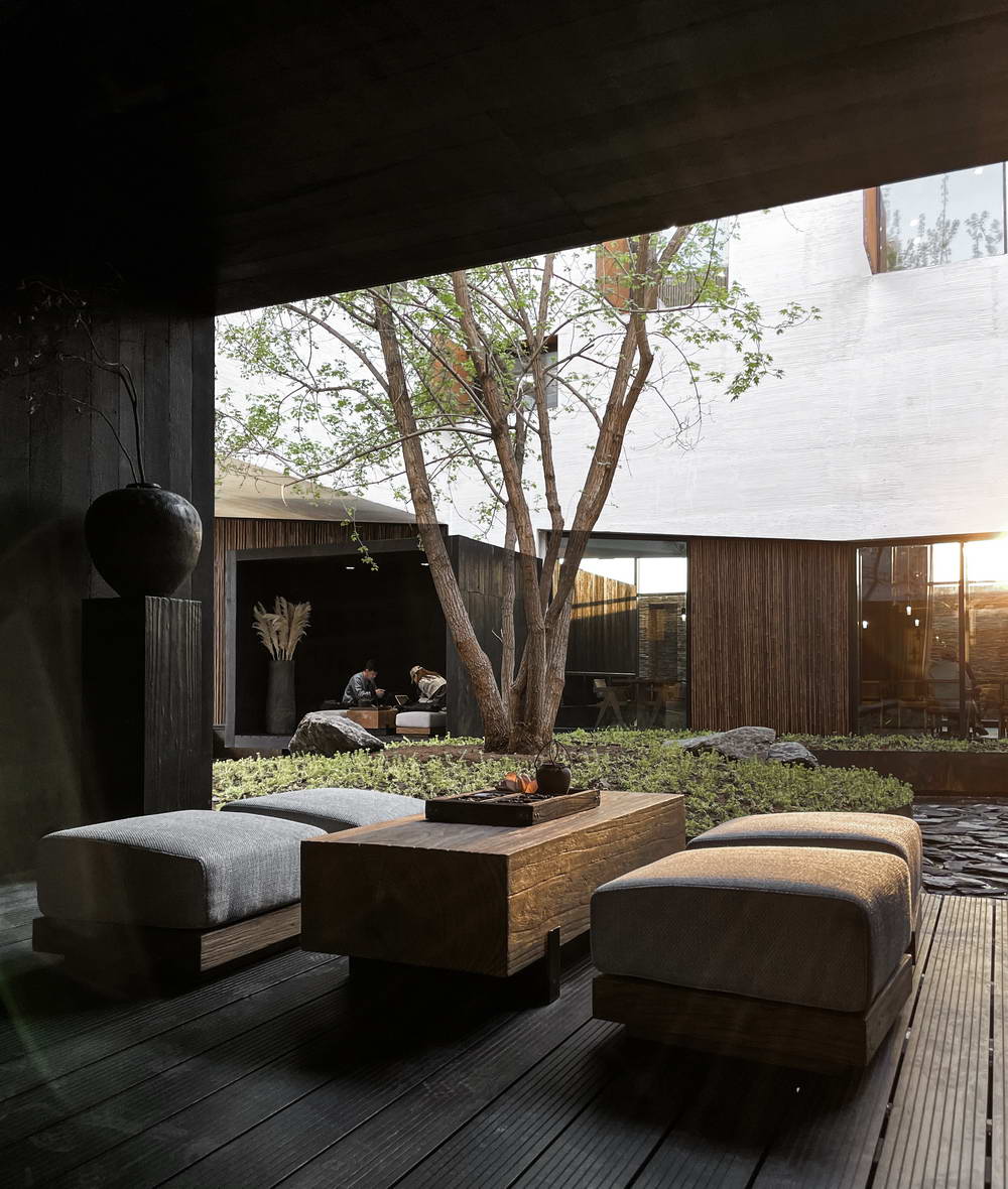
Courtyard

Then the sound of water gently enters the ear, and the line of sight naturally shifts towards the source of the sound. Under the sunlight, the water surface shimmers on the white textured eaves, with light moving with the water and water moving with the wind.
Courtyard Water Feature

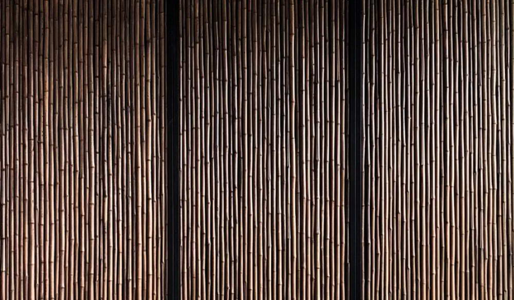
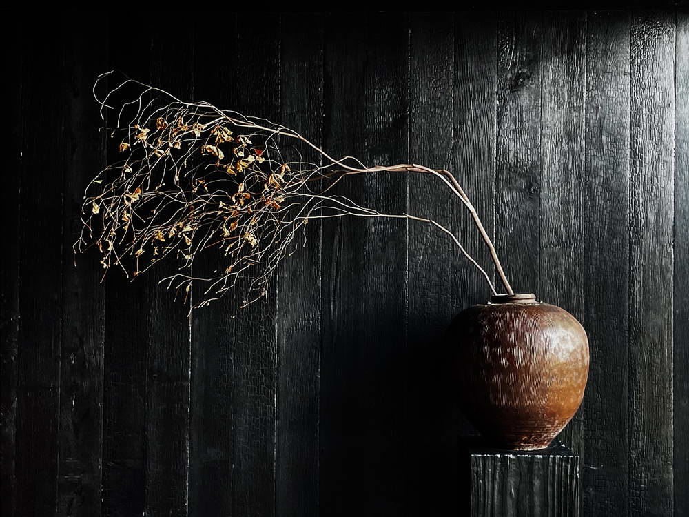
We hope to break the single exhibition model that only conveys information by placing objects or picture materials, making the building itself an exhibit. We use local materials such as fireboard, bamboo, and slabstone to express the regional culture. By controlling the flow lines and limiting people to move along the twists and turns of the space, visitors can perceive the information conveyed by the architecture.
Courtyard Water Feature

Between the slabstone walls, only vertical narrow openings are left, hinting at the expansive rice field scenery to the east. The act of concealing becomes an invitation, arousing curiosity and prompting people to explore and perceive on their own. If everything were visible at a glance, the joy of exploration would be lost.
Looking back at the building from the middle of the field, the white house seems to float above the rice stalks. The pure sloping walls form a rectangular opening, creating a "drama" of seeing and being seen. The "drama" inside the white house, hidden from view, invites people back in.
Esat Side Rice Field

This is what we hope to achieve—a seamless experience of moving through the interior and exterior of the building, encouraging people to step outdoors and explore, then return indoors to enjoy a meticulously planned multi-sensory experience.
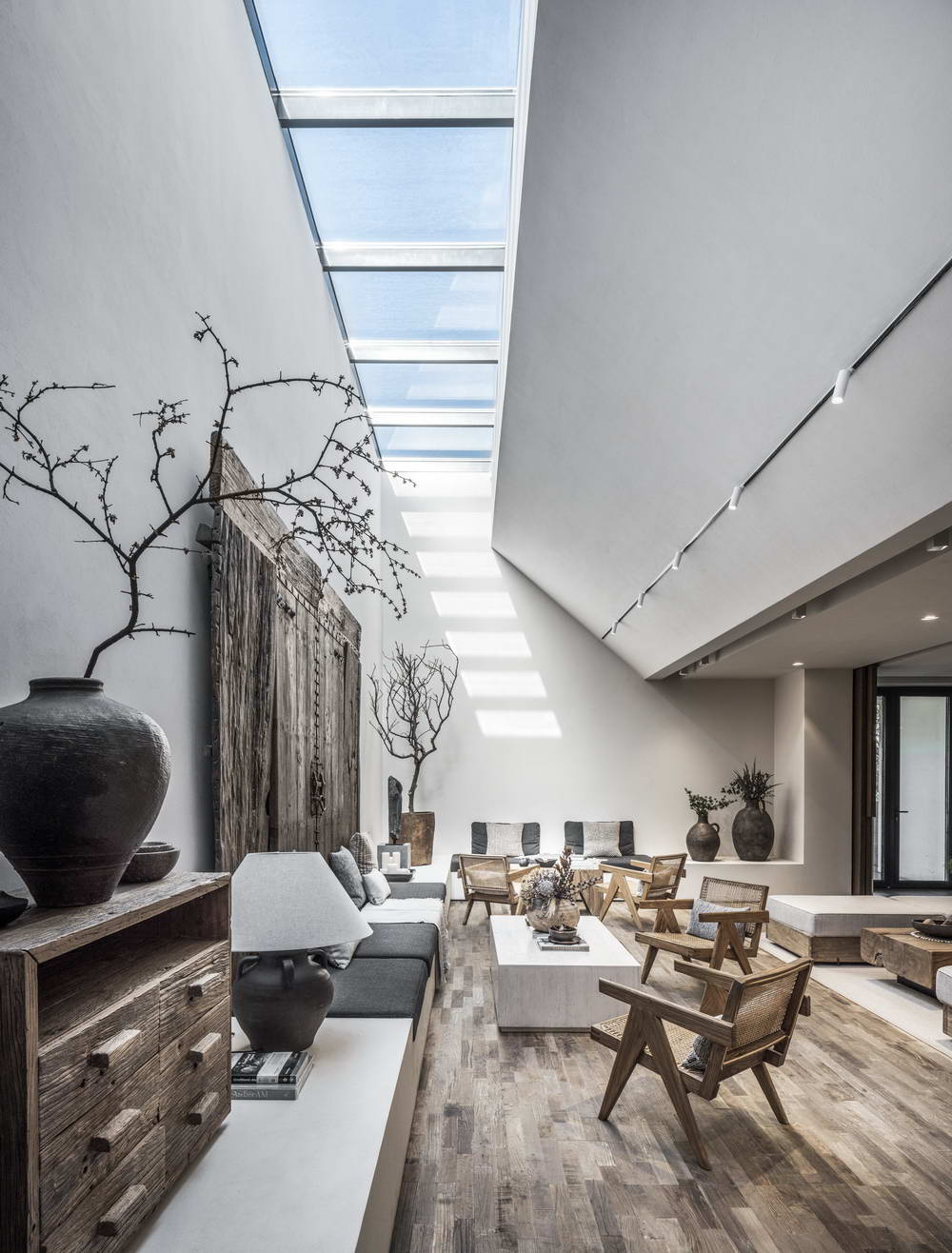
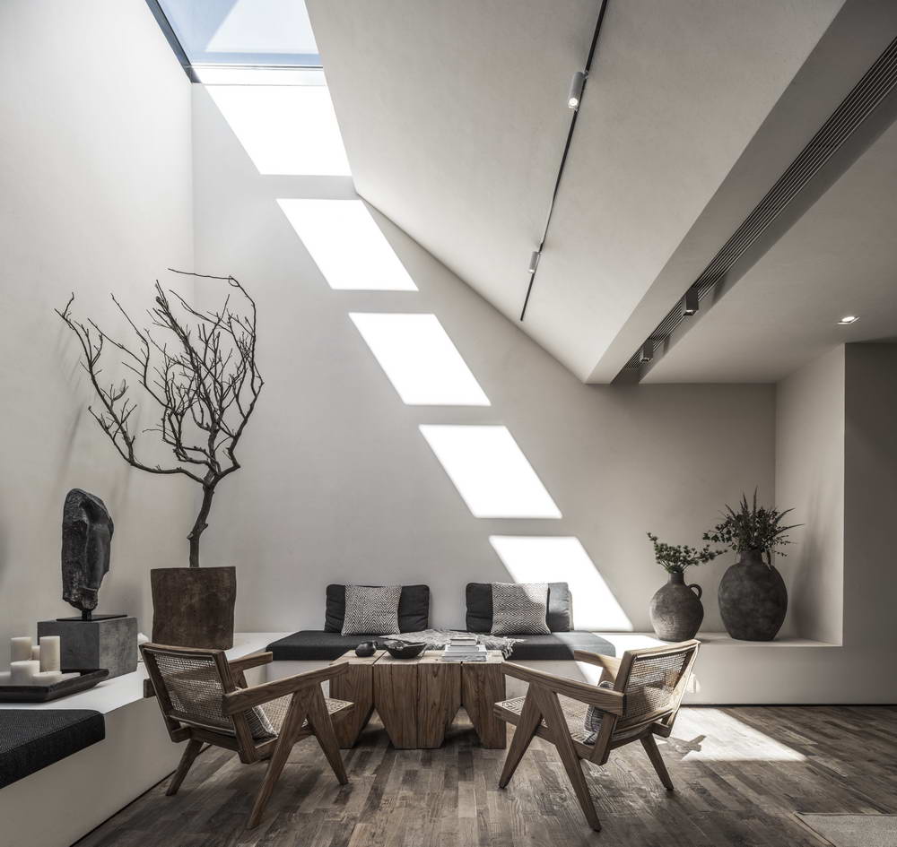
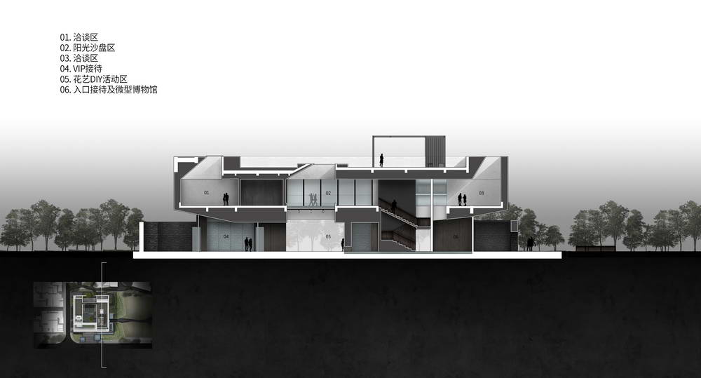
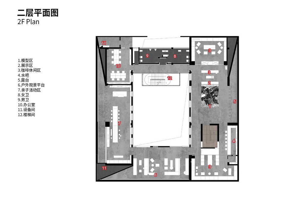
The second-floor coffee and drinks area is a relaxed place for conversation. We designed it with skylights instead of side windows. Thus, the "drama" that unfolds in the conversation area is private, unseen from the outside, and becomes the "drama" within the house, the "drama" that those outside the house are curious about. The converging sloping surfaces at the top define the skylights, and the narrow openings limit the amount of light and the visible expanse of the sky, but they are also more enticing.
Leisure Area on the Second Floor


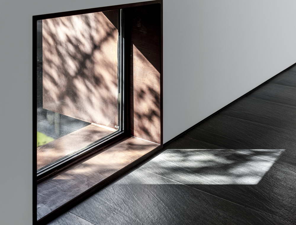
Light and shadow shift with the seasons, focusing through the skylights on the interior walls, floors, chairs, and tabletops. The light that cannot enter from the outside and the unseen sky become the boundless expanse in people's imaginations.
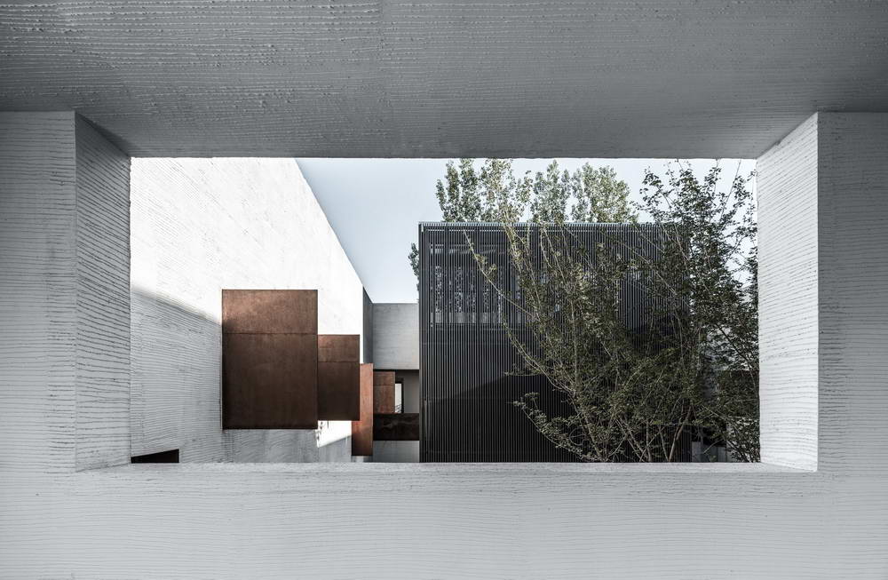
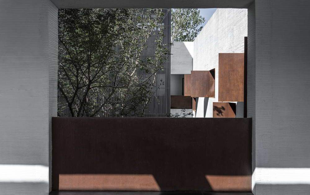
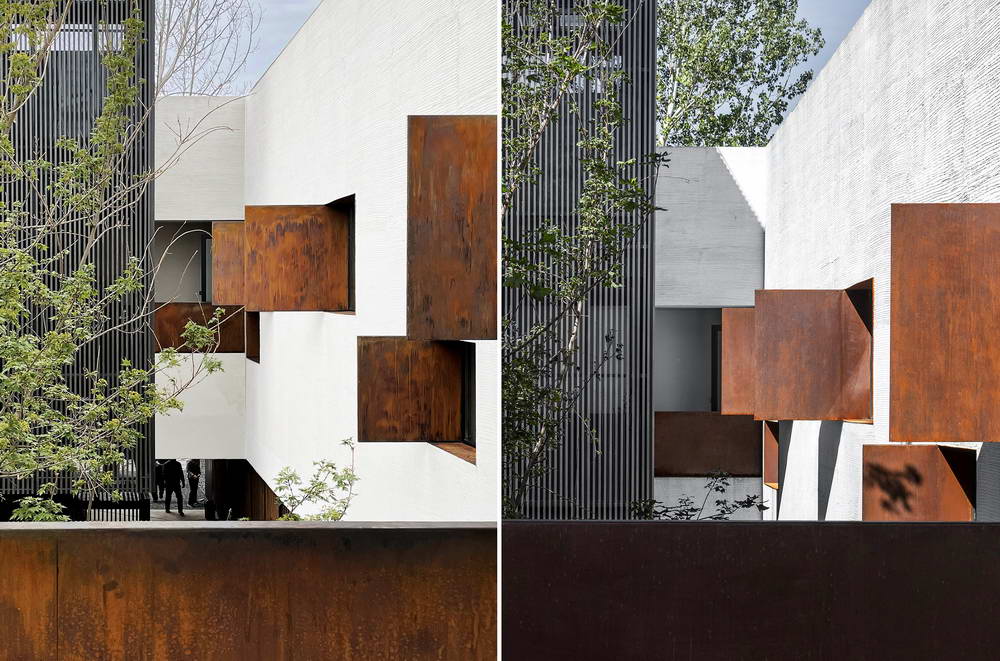
The second-floor inner court has scattered windows of varying sizes, with rust-colored steel elements interspersed among them, contrasting with the white textured walls, brown carbonized bamboo, and black carbonized wood. This creates a unique experience different from the minimalist exterior of the building. These architectural materials with their stories complement the courtyard greenery and water features, creating a bright and lively spatial narrative that adds a sense of lightness and vivacity to the entire building, refreshing people's initial impressions.


Window Hole

These windows of varying sizes and proportions are composed and combined, editing and assembling the people and scenes within the space. The viewers opposite are attracted by these disorderly fragments, each creating their own exciting narratives in their minds.
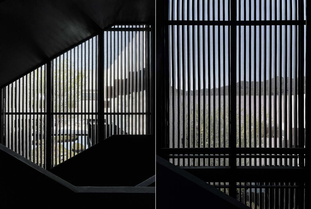
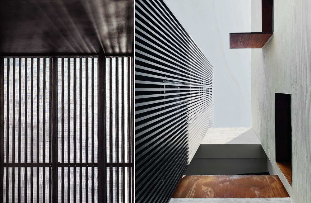
The black metal ladder serves as a clue that connects the interior of the house with the distant mountains on the roof. As one follows the clue and walks slowly upward, their view is wrapped in a filter composed of a metal mesh and wooden grille, hazy and expressive, illusory yet real. At this moment, the "picture frame" is cut into an irregular shape by the slope of the stairs, and the boundary changes with each step. The architectural space and sensory experience interact with each other, allowing one's thoughts to detach while being immersed in the space.
Relationship between the Black Metal Ladder and the Courtyard

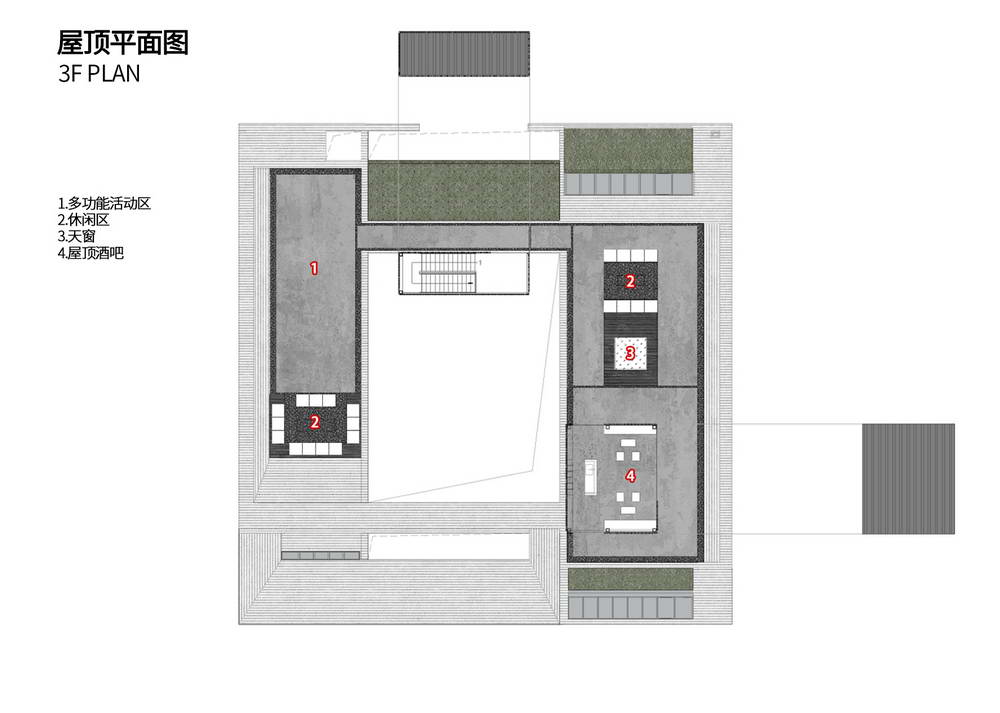
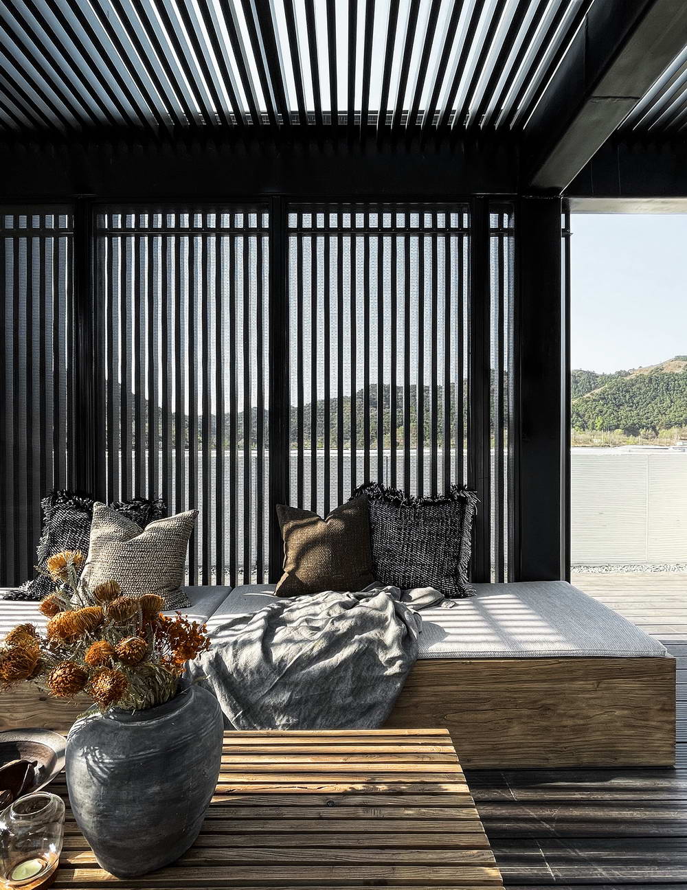
On the rooftop, we intentionally reduce interference, using ecological bamboo wood and crushed stone for paving, and defining the rooftop bar with materials that allow light and air to pass through, which is a continuation of the stairs. Wandering here and sitting on a bench to rest, one can listen to the wind, gaze at the mountains, watch the sunrise, and observe the sunset, closing their eyes to feel surrounded by nature. It's a momentary pause, not the final chapter.
Rooftop

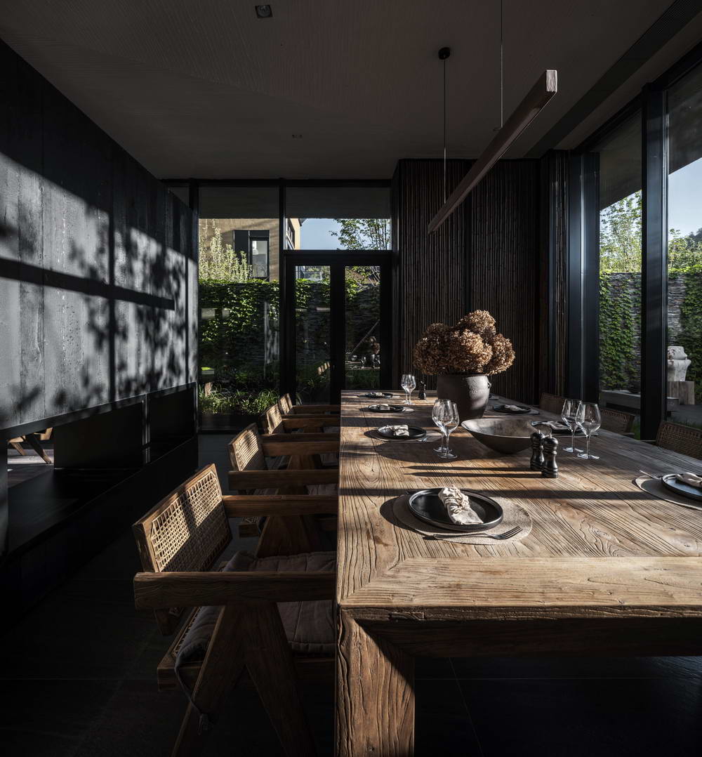
Food marks the end of the prologue. Returning to the ground floor restaurant—The Time-Honored Gourmet Research Institute, the space is filled with the atmosphere of life's daily activities. Large floor-to-ceiling windows bring the courtyard indoors. As you dine, a casual glance up reveals a view full of scenery.
Restaurant

The teahouse, embedded within the architecture and suspended over the water's edge, is an extension of the building and a probe into the courtyard. In turn, it becomes a part of the courtyard composition and a segment of the yard scenery. Tea drinkers inside the "box" observe the courtyard and the people scattered throughout the scenery; people in the courtyard are observing the view and the drama unfolding inside the "box"; those upstairs are overlooking, while those downstairs are looking up. The interplay of seeing and being seen, the crisscross of gazes, tightly connect people, architecture, and courtyard. Space becomes the medium through which all relationships occur.
Teahouse


Half mountain, half water, half field; half dwelling, half courtyard, half square pavilion.
Wine drunk to the right degree, flowers blooming at their peak. Architecture and landscape each take half, moderately yielding, leaving room for each other, which is restraint; yet they are interlocking, permeating, and connecting, which is balance, bringing infinite possibilities.
The building possesses the vitality of nature, and nature has a 'theater' for performance, achieving mutual success.
· Coexistence of Trees and Architecture
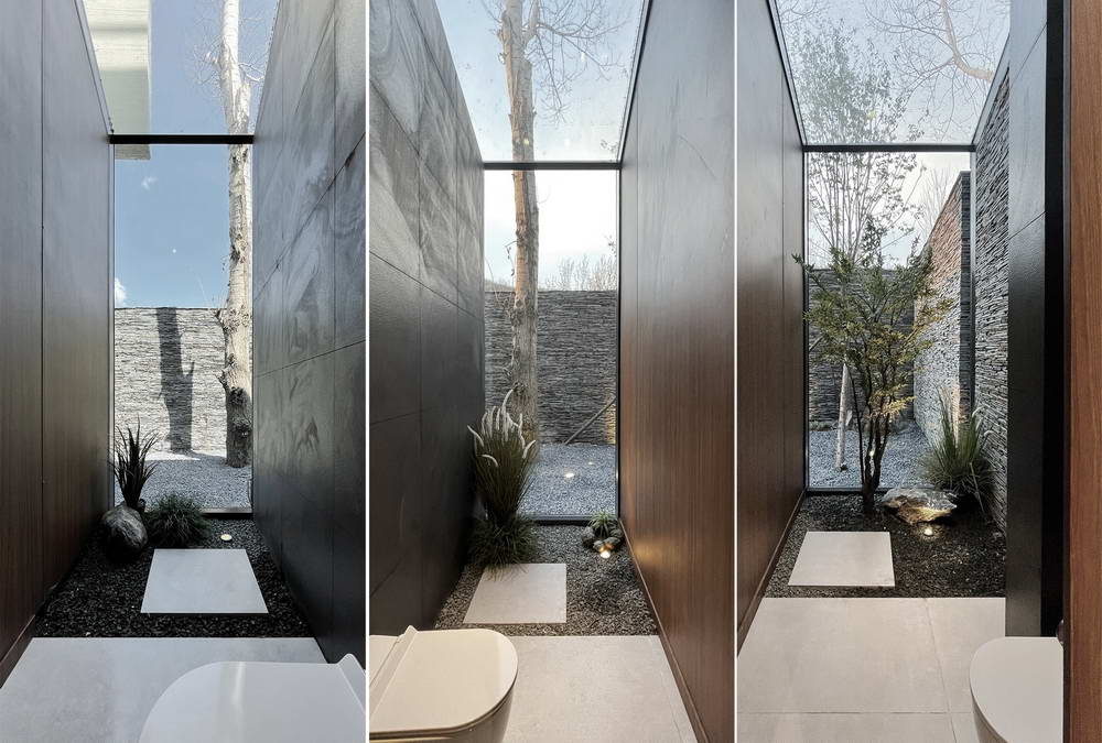
Two poplar trees originally stood on the north side of the site, perfectly facing the north side of the building. We incorporated one of the closer trees into the interior courtyard of the building, becoming the landscape tree of the courtyard landscape bathroom.
Washroom

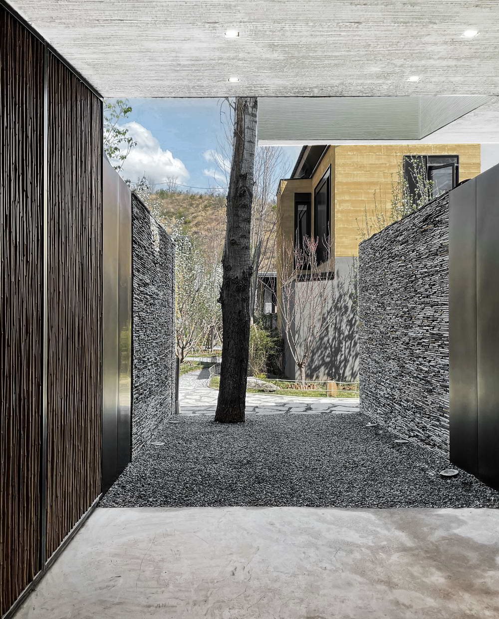
The other tree coincides with the boundary of the building, so the north facade of the building is deliberately designed with a cut-off effect to indicate the existing tree. The space yielded to the poplar tree happens to form the opening to the villa area. Having a tree of a certain age at an entrance that is not originally spacious is an interesting experience obtained by respecting the site and nature, which is different from conventional design. Respecting the site and nature, and in return, nature gives us more surprises.
The North Entrance

Details and Materials
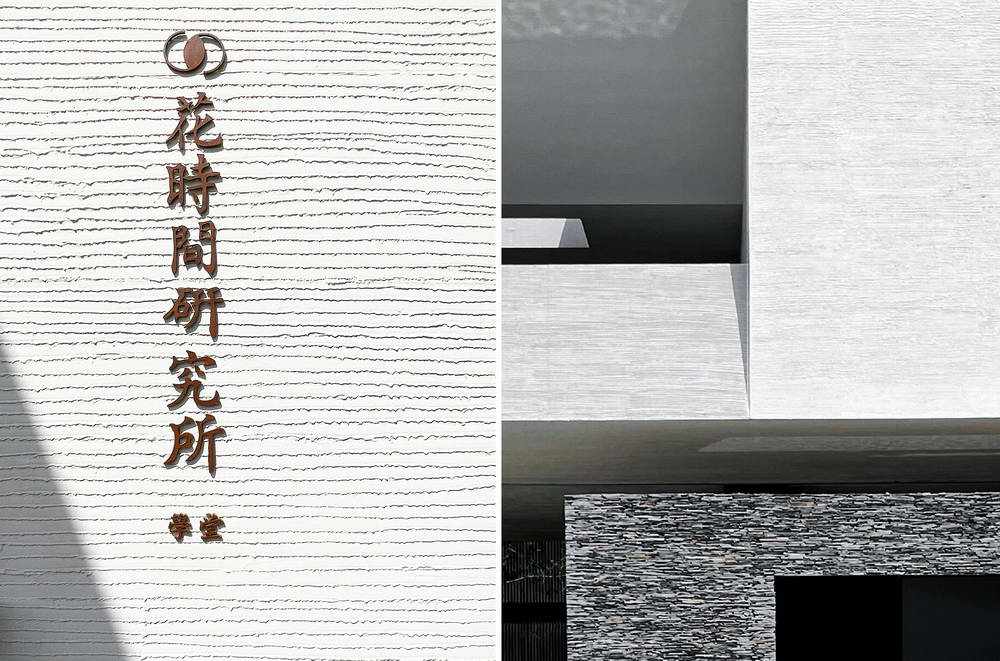
One of the main materials for the building facade is white textured paint, with the unordered and simple texture formed by the workers' on-site brushing. From afar, it looks clean and pure, and upon closer inspection, it is not lacking in details, presenting layers of light and shadow in the sunlight.
White Texture Paint

Schist


Moso Bamboo

Fire Wood

Rusting Steel Plate

Aluminum Grilling

Master Plan

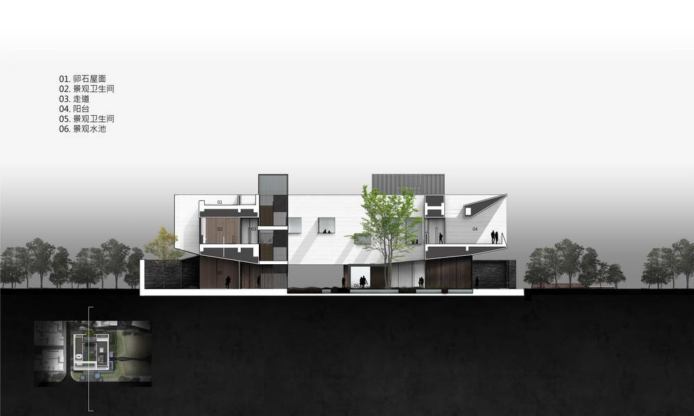
Section

Section

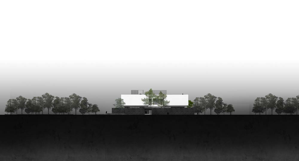
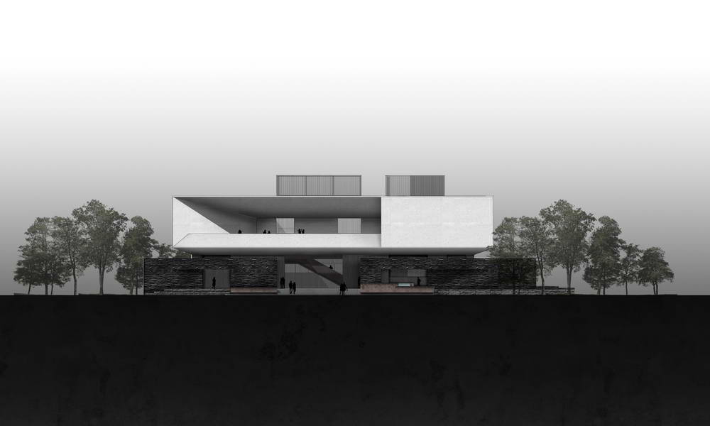
Elevatio

Elevatio

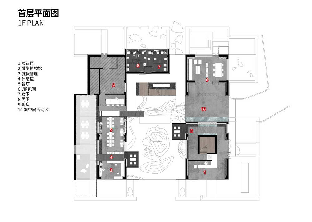
1F Plan

2F Plan

3F Plan
